Life Expectancies Around the Globe
Max Roser, Our World in Data, October 8, 2018
MCF Intersection
A regular snapshot of the trends, news and research in the world of philanthropy — and its impact on business.
Connect
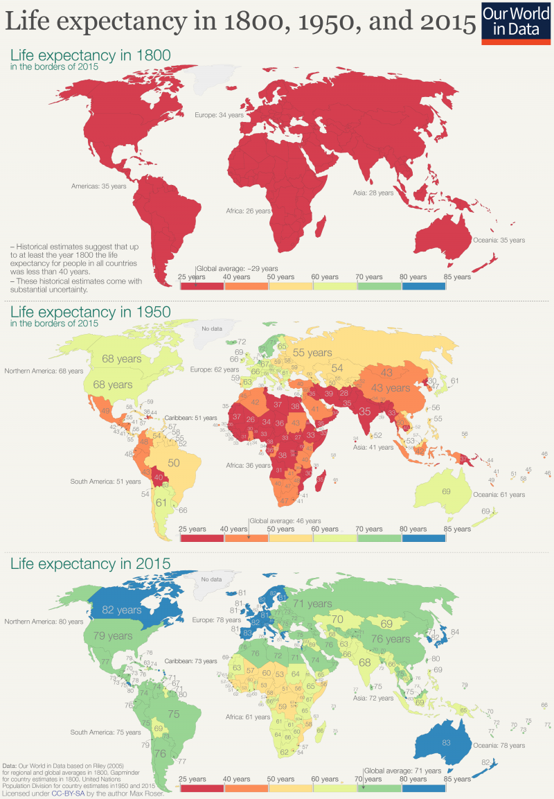
The three maps below show the global history of life expectancy over the last two centuries.1
Demographic research suggests that at the beginning of the 19th century no country in the world had a life expectancy over 40 years.2 Every country is shown in red. Almost everyone in the world lived in extreme poverty, we had very little medical knowledge or understanding of disease burden, and in all countries our ancestors had to prepare for an early death.
Over the next 150 years some parts of the world achieved substantial health improvements. A global divide opened. In 1950 the life expectancy for newborns was already over 60 years in Europe, North America, Oceania, Japan and parts of South America. But elsewhere a newborn could only expect to live around 30 years. The global inequality in health was enormous in 1950: People in Norway had a life expectancy of 72 years, whilst in Mali this was 26 years. Africa as a whole had a life expectancy of only 36 years. People in other world regions could expect to live more than twice as long.
The decline of child mortality was important for the increase of life expectancy, but as we explain in our entry on life expectancy increasing life expectancy was certainly not only about falling child mortality – life expectancy increased at all ages.
Such improvements in life expectancy — despite being exclusive to particular countries — was a landmark sign of progress. It was the first time in human history that we achieved improvements in health for entire populations.3 After millennia of stagnation in terrible health conditions the seal was finally broken.


MCF Intersection
A regular snapshot of the trends, news and research in the world of philanthropy — and its impact on business.
Connect
Now, let’s look at the change since 1950. Many of us have not updated our world view. We still tend to think of the world as divided as it was in 1950. But in health — and many other aspects — the world has made rapid progress. Today most people in the world can expect to live as long as those in the very richest countries in 1950. Today’s global average life expectancy of 71 years is higher than that of any country in 1950 with the exception of a handful in Northern Europe.
The visualization summarizes the global history of life expectancy over the last two centuries: Back in 1800 a newborn baby could only expect a short life, no matter where in the world it was born. In 1950 newborns had the chance of a longer life if they were lucky enough to be born in the right place. In recent decades all regions of the world made very substantial progress, and it were those regions that were worst-off in 1950 that achieved the biggest progress since then. The divided world of 1950 has been narrowing.
Globally the life expectancy increased from less than 30 years to over 70 years; after two centuries of progress we can expect to live more than twice as long as our ancestors. And this progress was not achieved in a few places. In every world region we can now expect to live more than twice as long.
The global inequalities in health that we see today also show that we can do much better. The almost unbelievable progress the entire world has achieved over the last two centuries should be encouragement enough for us to realize what is possible.
LIFE EXPECTANCY IN 1800, 1950, AND 20154
Footnotes
- To make comparisons possible they all use the same legend and the researchers that reconstructed the historical data have applied today's country borders when reporting the health of the past populations around the world.
- The country-by-country estimates for 1800 come with a considerable uncertainty and to not give a false sense of certainty I have not added these estimates into the map, but the estimates for life expectancies are considerably lower than 40 years – as is also shown for the regional and global estimates so that it is safe to assume that showing a life expectancy of less than 40 years on the map is correct. The few European countries with a life expectancy close to 40 years have more accurate data for this time period so that it seems unlikely that the life expectancy there was over 40 years, or at best it was only barely over 40 years.
- For a discussion of pre-health transition estimates of life expectancy see James Riley (2005) – Estimates of Regional and Global Life Expectancy, 1800–2001. Population and Development Review. Volume31, Issue3 September 2005 Pages 537-543. First published: 21 October 2005 https://doi.org/10.1111/j.1728...
- Data sources. I have relied on data from our entry on life expectancy and the combination of data we produced based on Riley (2005) for regional and global averages in 1800, Gapminder for country estimates in 1800, and the United Nations Population Division for country estimates in 1950 and 2015.
James Riley (2005) – Estimates of Regional and Global Life Expectancy, 1800–2001. Population and Development Review. Volume31, Issue3 September 2005 Pages 537-543. First published: 21 October 2005 https://doi.org/10.1111/j.1728...

Related Articles
Research
Rich Insights
02.23.18
Research
The Key Trait Great Leaders Share
03.19.18
Research
Dare to be Different
05.02.18
Research
High Quality Advisors
05.02.18
Research
Giving Up
06.27.18
Research
Philanthropy: Good for Business
08.08.18
Research
Dream Jobs
11.28.18
Research
The Worldwide 1%
02.13.19
Research
Funding Female Founders
04.01.19
Research
The Happiest Country
04.01.19
Research
Let’s Talk About Family Wealth
08.07.19

